
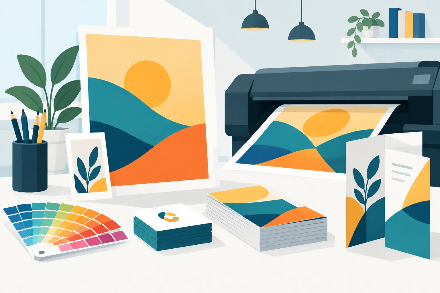
A potential customer may see your business card, menu, postcard, brochure, or vehicle graphic before they ever visit your website. That first physical impression has to work fast. Professional print design services help North Texas businesses turn everyday marketing materials into clear, credible tools that make people remember who to call.
For a contractor leaving estimates, a restaurant promoting a special, or an office handing out referral cards, print is not just decoration. It is a chance to make your business look organized, established, and ready to help. Poorly planned print pieces do the opposite: tiny type, muddy colors, crowded layouts, and outdated contact information can make a solid company look careless.
What Print Design Services Should Solve
Good print design starts with a business question, not a software program. Are you trying to get more calls from a neighborhood mailer? Help prospects understand a complicated service? Make your staff look consistent at a trade show? Give customers something useful to keep after an appointment?
The right piece depends on the answer. A one-page flyer can be effective for a limited-time offer, while a folded brochure gives a professional services firm room to explain its process and build trust. A business card has very little space, so the priority is instant recognition, readable contact details, and a reason to follow up. Trying to make one item do every job usually creates clutter.
Strong design also connects print to the rest of your marketing. The same logo, colors, message, phone number, website address, and service focus should show up consistently across signs, social media, your Google Business Profile, and your website. A customer should never wonder whether two pieces of marketing belong to the same company.
Start With the Customer’s Next Step
Before choosing paper stock or colors, decide what you want the reader to do. That may be calling for an estimate, booking an appointment, asking for a consultation, bringing in a coupon, or visiting a specific web page. A print piece without a next step may look nice but still fail to produce results.
Keep that next step simple. If a postcard asks people to call, scan a code, visit three pages, follow five social accounts, and read a long list of services, it creates friction. One primary action is usually enough, supported by the information a person needs to feel comfortable taking it.
For local businesses, clarity beats cleverness. A homeowner in Kennedale or Fort Worth who needs help quickly should be able to spot what you do, where you serve, and how to reach you in seconds. That does not mean every piece needs a giant headline and oversized phone number. It means the important information earns the best placement and the easiest-to-read type.
Match the Format to the Job
Print design works best when the format fits the moment. Business cards travel easily and work well after introductions. Door hangers and postcards put a focused local offer directly in front of nearby households. Rack cards can support hospitality, real estate, and visitor-facing businesses. Presentation folders, sell sheets, and brochures help when prospects need more confidence before making a larger decision.
Signage has a different job. Window graphics, banners, yard signs, and event displays must be understood from a distance, often while someone is moving. They need fewer words, stronger contrast, and bolder visual hierarchy than a brochure someone reads at a desk.
It depends on your audience and buying cycle. A fast, affordable service may benefit from a direct offer and a clear call to action. A business-to-business company with a longer sales process may need materials that explain expertise, process, proof, and service areas. The best print design is not the busiest. It is the one that makes the next decision easier.
The Details That Separate Good Print From Costly Reprints
A design that looks fine on a monitor can fail on paper if the production details are ignored. Screens use light to create color, while commercial printing uses ink. Bright RGB colors can shift when converted for print, especially intense blues, greens, and fluorescent shades. A designer should plan colors for the actual print method instead of hoping the printer will make them match.
Image quality matters just as much. A graphic pulled from a website is often too small for a large brochure panel, banner, or sign. Enlarging it can produce soft edges and visible pixelation. Logos should ideally be available as vector files so they stay sharp at any size. Photos need enough resolution for the final printed dimensions.
Bleed and safe margins are easy to overlook, but they protect the finished piece. Bleed gives background colors and images extra room beyond the trim edge, preventing unwanted white slivers after cutting. Safe margins keep text and critical details away from that edge. These are small setup choices with a major effect on whether the final piece feels polished.
Paper is part of the message, too. Thick matte stock can feel professional and understated. Gloss stock can make product photography pop. Uncoated paper can be easier to write on, which helps with appointment cards, forms, and notes. Premium materials cost more, so the decision should reflect the piece’s purpose, expected lifespan, and distribution volume.
Build a Consistent Print Toolkit
Small businesses do not need a different visual style for every promotion. In fact, a repeatable set of branded materials saves time and reduces mistakes. Once the core look is established, future pieces can be created faster without looking copied and pasted.
A practical toolkit may include the following items:
- Business cards for owners, sales staff, and field teams
- Letterhead, envelopes, and estimate or invoice templates
- Flyers or postcards for service promotions and local outreach
- Brochures or sell sheets for detailed services and sales meetings
- Banners, signs, and event materials for visibility away from the office
These materials should use a consistent logo version, approved colors, type styles, image approach, and contact information. That consistency becomes especially valuable when multiple employees create documents or when a business adds new locations, services, or seasonal campaigns.
It also prevents the common problem of outdated materials lingering in circulation. If an old phone number, retired email address, or previous logo appears on a stack of cards, every handout becomes a missed opportunity. A simple brand library and periodic review can keep your materials current.
Review Before You Send Anything to Print
The final proof is where good projects are protected. Read every headline, price, phone number, service area, and web address slowly. Ask someone who did not create the piece to review it as well. Fresh eyes catch errors that become invisible after hours of editing.
Check whether the call to action is clear, whether photos look sharp at the intended size, and whether the design still works in black and white if it may be photocopied. If a QR code is included, test it from a printed proof, not just from your screen. Make sure it leads to a page that works well on mobile and matches the promise on the printed piece.
At TechXperts, print design can be planned alongside your logo, website, SEO, and local marketing so customers receive one consistent message wherever they find you. That matters because marketing materials should support real business operations, not become another disconnected project to manage.
A well-designed printed piece will not replace great service, but it can get your business in the door before the conversation begins. Give people something clear, useful, and worth keeping, and let every handout reinforce the professional work you do.


0 Comments